A new kind of together
As we launch our new identity, we share the ideas and instincts that shaped it, and what we hope it makes possible.
Funders Together exists so that communities are better served by funding.
This means a sector where every organisation can contribute fully, without losing what makes them distinctive. This ambition has shaped the decisions we have made as we developed our new identity.
Thousands of organisations make up the funding sector, each working at their own pace, to deliver their own priorities and with their own deep histories and relationships with communities and good causes. We see this diversity as the sector's greatest strength.
It's from that strength and diversity that Funders Together builds from. We are now a space that connects the rich histories of London Funders, 360Giving, Collaboration Circle and the Place-based Giving Resource hub.
Each carries its own identity, audiences and expertise built over years of practice and partnership. All this, whilst making room for future collaborations and programmes that do not yet have names.
Holding plurality, not resolving it
The design challenge has been both visual and conceptual: how do you build a unique identity that holds plurality rather than resolving everything too neatly?
We started working with design partners Effusion in December 2025, sitting honestly with this set of live tensions. Movement and convening. Ambition and reassurance. The clarity that a brand requires, and the agility that only survives if you stay focused against over-defining things too early.
The answer was yarn
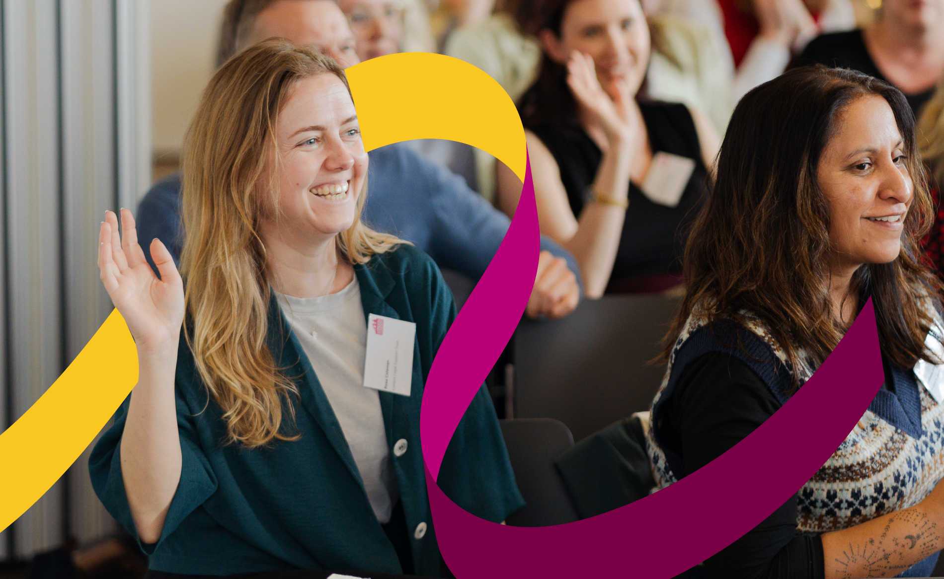
Yarn is a flexible material that layers and builds into something stronger over time. In the Funders Together mark, multiple strands wrap around a common centre, held together by the ongoing act of coming together rather than by a fixed point of control.
The form is circular, suggesting connection and completeness, but each strand remains visually distinct within it. Nothing is absorbed. Nothing disappears into the whole.
“The strands are there. The relationships, connections, shared truth. They have always been there. The opportunity is in building structures that let each one reach further.”
The visual identity that surrounds our new logo reflects the same instinct. Deep teal, warm orange and pink, a palette confident and open in equal measure, warm enough to signal invitation, distinctive enough to hold its own. Flexible enough that the teams building within it retain their own visual language and identities.
A commitment as much as an identity
We build alongside distinctive platforms, programmes and initiatives that share our commitment to funding built on fairness and trust, powering communities to positively shape the world.
There is real energy in working this way, across and between organisations, outside the traditional structures and hierarchies that have so often defined the sector we work in. Our new identity does not absorb them. What we offer is the strength that comes from being woven together — the kind of coherence that makes each strand more powerful.
Our identity is built to be a living system, one that evolves as we evolve, through new programmes, new partnerships and configurations. It will adapt to new ways of working we cannot yet fully anticipate. The brand, and the idea behind it, is built to hold that potential.
This is the next chapter of a long, shared story. Our direction is clear, even as the details continue to form. We are developing it with the sector, not ahead of it, and we would love you to be part of what comes next.
From everyone at Funders Together.